
Cordelia Sanders’ Ambrotype
Katie Maxwell, Visitor Services and Design Coordinator
Cordelia Sanders’ Ambrotype
Since resolving to draw three portraits based on damaged photographs (find my first portrait here), I’ve been on the lookout for other damaged photographs. In order to avoid becoming paralyzed by indecision, I’ve decided to stick to images featured in Library Company online exhibitions. While perusing Fashioning Philadelphia: The Style of the City, 1720-1940, I found this ambrotype:
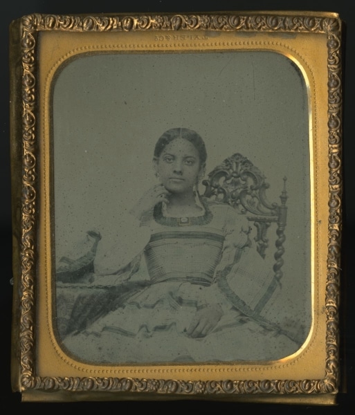
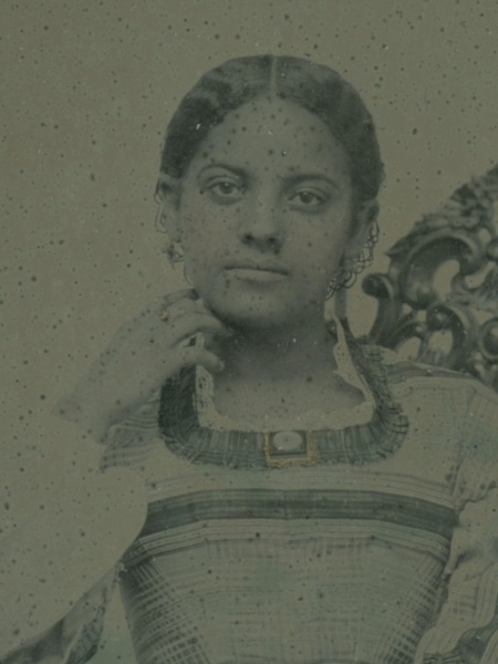
Tyler & Co., [Portrait of Cordelia Sanders], ca. 1857. Ambrotype. Stevens-Codgell/Sanders-Venning Portrait Collection, P.2014.51.2. Gift of descendants of Cordelia H. Brown, Lillie V. Dickerson, Mary Hinkson Jackson, and Georgine E. Willis in honor of Phil Lapsansky.
In this portrait, teenage Cordelia Sanders, later Chew, rests her chin delicately against her right hand. She is dressed elegantly in a plaid dress with pagoda sleeves. She wears a ring, a brooch, and a pair of dangling earrings. Gold accents have been added to the ring and brooch.
Although both methods use chemicals, an ambrotype, unlike a daguerreotype, is a negative image that is revealed when placed over a dark backing.
Here, the whole image appears rather dark. Highlights are hard to distinguish from midtones, flattening the effect.
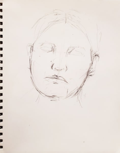
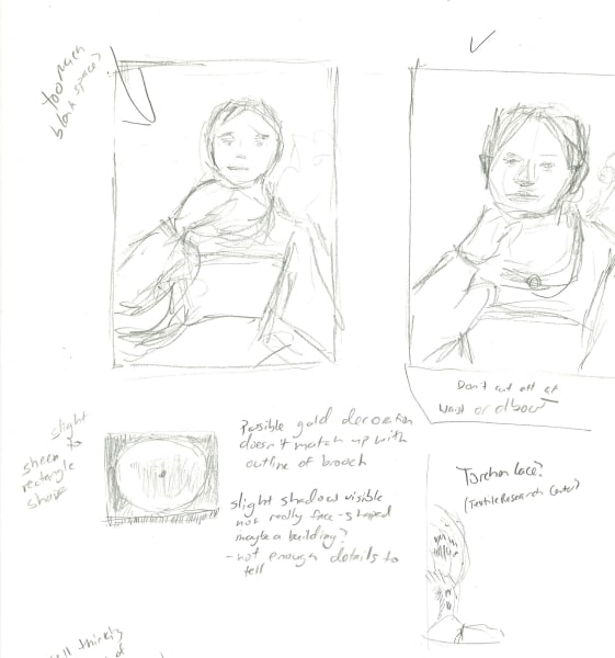
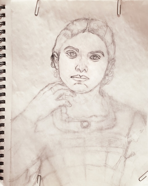
I decide to eschew the table and chair from my rendering. Although the chair is elegantly carved, I don’t want anything drawing focus away from Cordelia’s face. She seems to give the viewer an appraising look. I’ll also have to decide where to crop the image in order for it to fit on my 9 x 12 in. paper. That decision can wait though while I study the face.
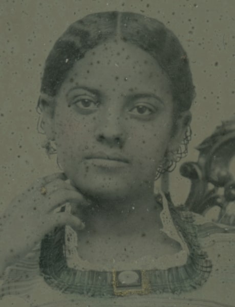
The diffuse light on the face leaves very faint shadows, adding a bit of a challenge to the rendering, so I focus on darkening the shadows and preserving highlights on the cheekbones, chin, and nose.
In the 1864 book, The Camera and the Pencil; or the Heliographic Art, Its Theory and Practice in All Its Various Branches; e.g.–Daguerreotypy, Photography, &c …, author Marcus Aurelius Root offers this advice on page 106 about lighting the face:
“The lights and shadows on the face, or other parts of the picture, must be managed with the greatest care, in order to produce rotundity, relief, harmony, and life-like effect.”
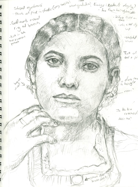
Sanders’ hair is parted and pulled into an updo behind her head leaving sculptural waves. The style is accented with a dark lace hairnet. As I zoom in, I realize that the earrings look somewhat like bouquets of roses. This immediately sets off a search. After scouring auction, jewelry, and museum websites, I theorize that these earrings are in the style of Etruscan Revival (a period in which designers were inspired by Etruscan excavations in Italy).
Although the gold and coral earrings below aren’t the same design as Sanders’, the sculpted roses remind me of the floral shapes in her jewelry.
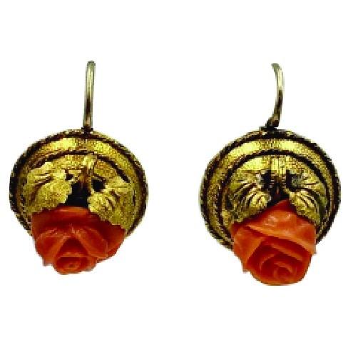
Left: Victorian Coral Rose Earrings Etruscan Revival 14 Karat Gold Flower Leaf motif for sale at 1stDibs.com
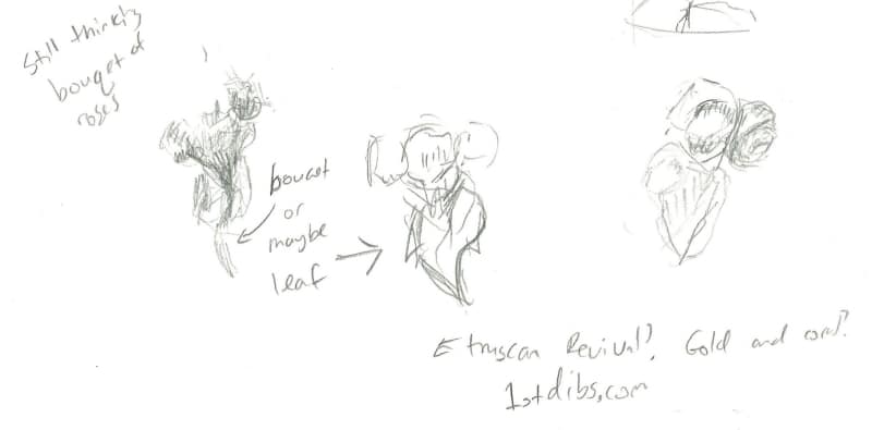
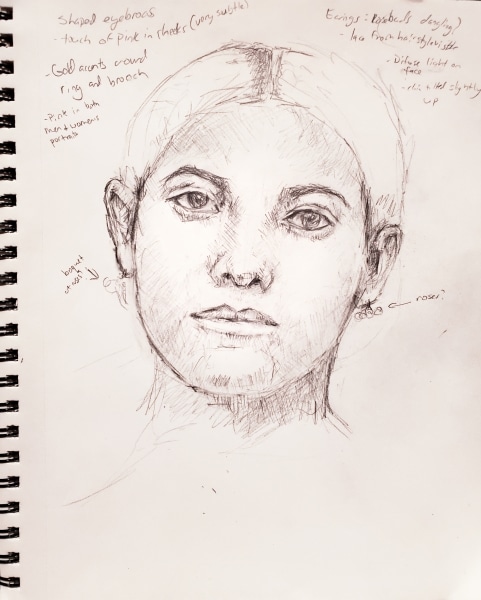
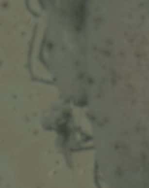
I initially thought the triangular shape on the bottom portion of the earrings was part of a bouquet shape, but after some sketching, I have come to believe that the shape is a leaf. However, the brooch confuses me a bit. As I look closely, I see that the gold accents added to the picture do not exactly line up with the edges of the brooch.
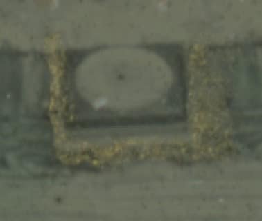
The gold near the lower side of the pin seems to lay on top of the ruffles in the neckline, so I’m not sure how or if gold was incorporated into the actual brooch. I’ll figure that out later. After completing a couple of quick thumbnail sketches, I settle on a composition that will include Sanders’ face, most of the bodice of her dress, and parts of her arms that avoid awkwardly cropping them at any joints.
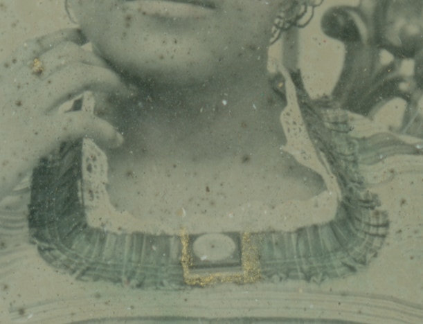
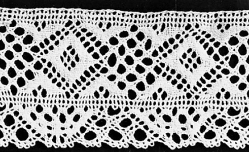
I move on to the clothes. The lace at her neckline reminds me of crocheted work. This example of torchon lace in the Textile Research Center’s digital collections strongly resembles the collar of Sanders’ garment, so I think I can render the lace neckline somewhat accurately.
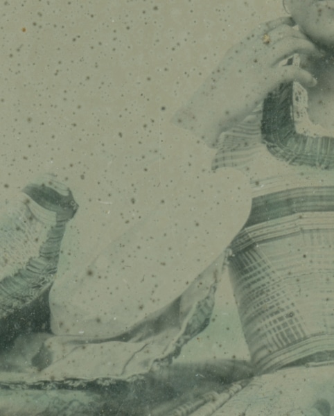
Moving on, the wide sleeve of her dress is lined in a lighter-colored cloth and fits over a billowy inner sleeve. There is not enough light and shadow on the inner sleeve for me to see all of the details of its shape.
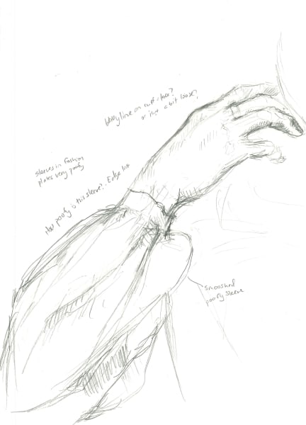
I attempt to sketch Sanders’ sleeve, but since some of the edge isn’t visible in the ambrotype, I have to do some guesswork.
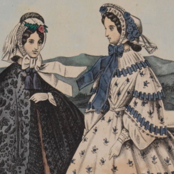
Detail of Louis Haugg, Philadelphia, Paris & New-York Fashions, for Spring & Summer of 1864(Philadelphia: Published and sold by F. Mahan, 1864). Color by A. Biegeman.
In this fashion plate, the inner sleeves of the woman on the right are quite billowy and have elaborate, lacy cuffs. Although this plate was made a few years later than Cordelia’s portrait, the general silhouette looks very similar. Thanks to this video from Prior Attire, I understand that the undersleeves or false sleeves were separate pieces. (Go to timestamp 13.02 to see the undersleeves.)
I move onto the final sketch.
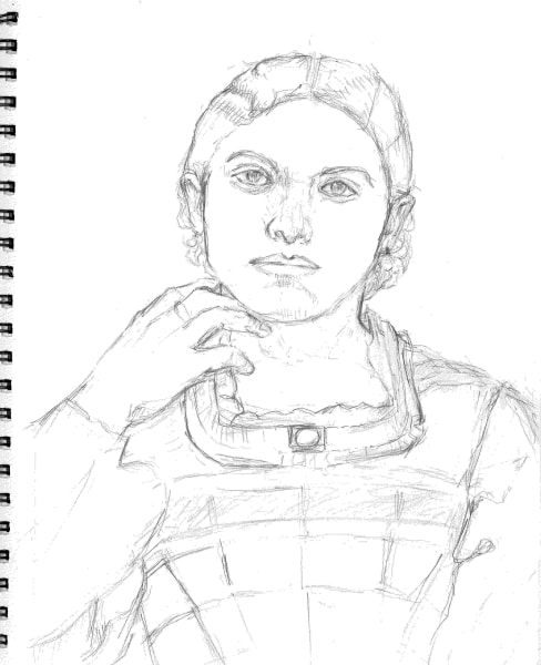
I’ve drawn the lines of the seams (or where I think the seams of the dress are), but rendering the plaid pattern is going to take a while, so I’ll save that for later.
When I transferred my previous drawing, I accidentally indented the paper, this time I take pains to trace it gently. The result is that I can’t get a good picture of the final graphite drawing.
I start shading with violet and orange.
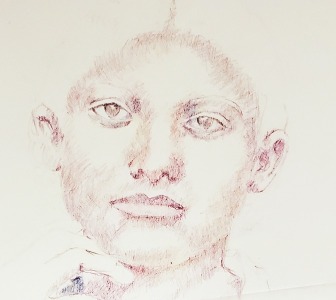
And gradually introduce yellow ochre.
And then introduce a bit of pink in the cheeks. Eventually, I realize that I’ve drawn the hairline too low, so I raise both the hairline and the top of the head.
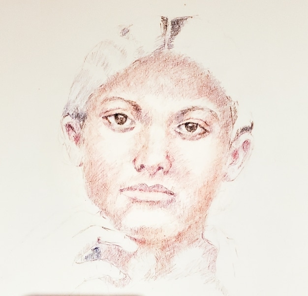
It is time to move on to the clothes. I don’t know what color the dress was, but inspired by this one, I’ve settled on a blue and teal color scheme. I’ll follow as much of the pattern as I can see and extrapolate what I can’t.
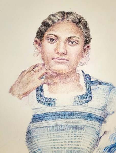
I am nearly finished with the plaid pattern. I was right, although it isn’t a difficult process, rendering the pattern is taking a while. The real trick is making sure the plaid follows the folds in the cloth.
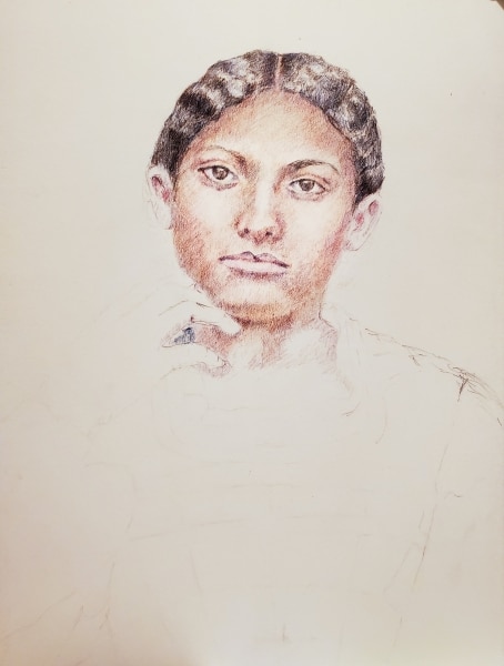
Once I complete the sleeves and lace accent at the collar, I can’t put off rendering the brooch any longer.
It’s an oval shape set over a dark rectangle shape. Looking carefully, I think there may be another rectangle underneath.
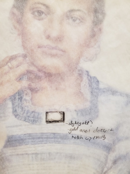
In the article, “On Coloring Daguerreotypes” from The Photographic Art-Journal (January, 1853), author H.H. Snelling states, “The method of laying colors on daguerreotypes is one of considerably [sic] difficulty, inasmuch as they are used in the form of perfectly dry, impalpable powder.” (pg 60). I now realize that it was unrealistic to expect precision with such a delicate process. I’ve decided to suggest a subtle gold setting below the darker rectangle of the brooch.
Finally, the completed portrait with all accessories.
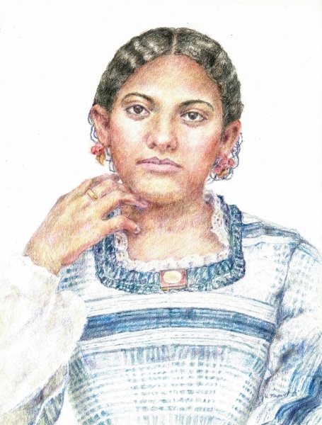
I tried to preserve the softness of the light and shadow in the original ambrotype while increasing the contrast in Sanders’ face and drawing the viewer to her eyes.
Sources
Franklin, Harper. “1850-1859.” Fashion History Timeline. Accessed December 14, 2022.
https://fashionhistory.fitnyc.edu/1850-1859/
Jackson, Tracy, “Photographs: Daguerreotypes and Ambrotypes.” Special Collections & the Gallery. Accessed January 2, 2023.
http://blogs.shu.edu/archives/2014/10/photographs-daguerreotypes-and-ambrotypes/
Root, M.A., The Camera and the Pencil; or the Heliographic Art. Philadelphia: M.A. Root J.B. Lippincott & Co.,1864. https://archive.org/details/camerapencilorh00root/page/n7/mode/2up?view=theater
Snelling, H. “On Coloring Daguerreotypes,” The Photographic Art Journal (January 1853), 60-61. https://ia800700.us.archive.org/15/items/photographicartj51853snel/photographicartj51853snel.pdf
Further Reading
Piola, Erika. “Counter Archives in the Library Company Graphic Arts Collection: Invisible Philadelphia Made More Visible through the Stevens-Cogdell/Sanders-Venning Portrait Collection.” Imperfect History: Curating the Graphic Arts Collection at Benjamin Franklin’s Public Library: A Collection of Essays. Philadelphia: Library Company of Philadelphia, 2021, 47-69.
Click here to add your own text
Click here to add your own text
Click here to add your own text
Click here to add your own text
Click here to add your own text
Click here to add your own text
Click here to add your own text

